


Introduction
After a six month hiatus, I’m excited to return to writing and share some advanced and engaging examples of using text fields.
Text fields are fundamental in building interactive and dynamic UI components, and Jetpack Compose offers a range of features to make them not only functional but also visually appealing and highly interactive.
In this article, we will start with the basics of implementing a simple text field and progressively move towards more advanced features. We’ll explore a variety of enhancements including gradient text, decoration boxes, and funky text styles.
We’ll delve into practical use cases such as masked text fields for data entry and real-time user tagging. Finally, we’ll cover rich media support and haptic feedback to ensure accessibility and improve user experience.
By the end of this article, you’ll have a comprehensive understanding of the powerful capabilities Compose offers for text fields and how to utilize them to create engaging, user-friendly applications.
1) The Basics
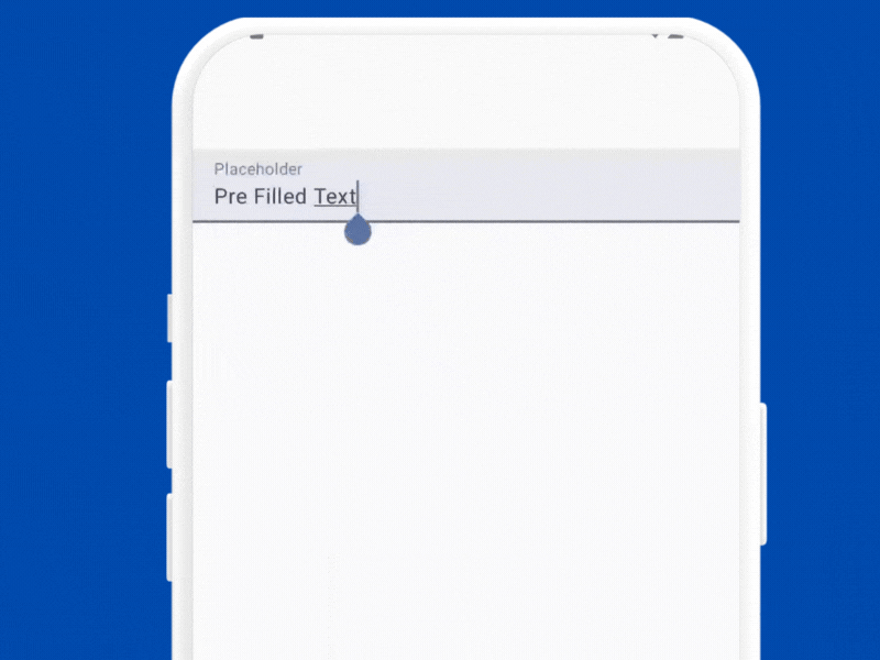
Before diving into the “more”, let’s start with a simple example to introduce the basics of text fields in Jetpack Compose.
@Composable
fun BasicTextFieldExample() {
var text by remember { mutableStateOf("Pre Filled Text") }
    TextField(
        value = text,
        onValueChange = { text = it },
        label = { Text("Placeholder") }
}
Explanation
- The
valueparameter is bound to thetextstate variable, ensuring that the text field displays the current state. - The
onValueChangelambda is called whenever the user types into the text field, updating the state with the new text.
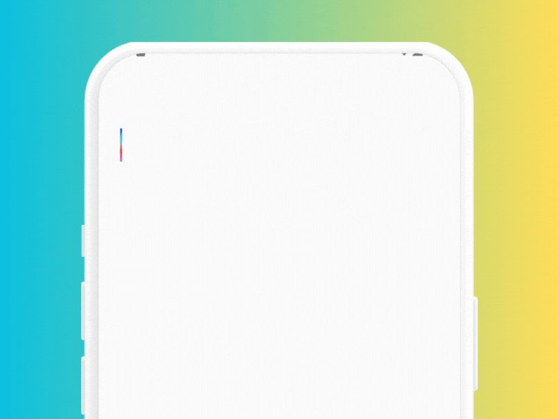
2) Gradient Text Field
@Composable
fun GradientTextField() {
    var text by remember { mutableStateOf("") }
    BasicTextField(
        value = text,
        onValueChange = { text = it },
        textStyle = TextStyle(
            brush = Brush.linearGradient(
                colors = listOf(Color.Red, Color.Blue, Color.Green, Color.Magenta)
            ),
            fontSize = 32.sp
        ),
        cursorBrush = Brush.verticalGradient(
            colors = listOf(Color.Blue, Color.Cyan, Color.Red, Color.Magenta)
        ),
    )
}
Explanation
- The
textStyleparameter is used to apply the gradient style to the text. - The
Brush.linearGradientfunction creates a linear gradient using a list of colors. In this example, the gradient transitions through red, blue, green, and magenta. - The
cursorBrushparameter is used to apply a vertical gradient to the cursor. - The
Brush.verticalGradientfunction creates a vertical gradient for the cursor using a list of colors. In this example, the gradient transitions through blue, cyan, red, and magenta.
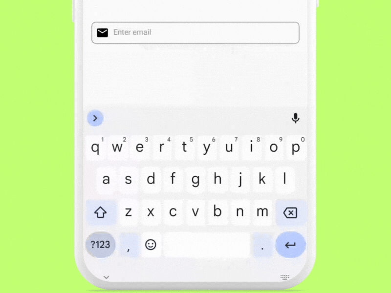
3) Decoration Box
@Composable
fun DecoratedTextField() {
    var text by remember { mutableStateOf("") }

    BasicTextField(
        value = text,
        onValueChange = { text = it },
        decorationBox = { innerTextField ->
            Row(
                Modifier
                    .padding(horizontal = 16.dp, vertical = 50.dp)
                    .border(1.dp, Color.Gray, RoundedCornerShape(8.dp))
                    .padding(8.dp),
                verticalAlignment = Alignment.CenterVertically
            ) {
                Icon(Icons.Default.Email, contentDescription = "Email")
                Spacer(modifier = Modifier.width(8.dp))
                Box(
                    modifier = Modifier.weight(1f)
                ) {
                    if (text.isEmpty()) {
                        Text(
                            text = "Enter email",
                            style = TextStyle(color = Color.Gray)
                        )
                    }
                    innerTextField()
                }
                if (text.isNotEmpty()) {
                    IconButton(onClick = { text = "" }) {
                        Icon(Icons.Default.Clear, contentDescription = "Clear text")
                    }
                }
            }
        },
        textStyle = TextStyle(
            color = Color.Black,
            fontSize = 16.sp
        )
    )
}
Explanation
- The
decorationBoxparameter allows you to add custom decorations around theBasicTextField. - In this example, we use a
Rowcomposable to place an email icon, a placeholder, and a clear button next to theBasicTextField, adding padding and a border for better visual separation. - The placeholder text “Enter email” is displayed when the
textstate is empty. - This is achieved by wrapping the
innerTextFieldin aBoxand conditionally displaying the placeholder text.
4) Let’s Go Funky
Let’s build some funky text while learning some more options available to us which might be useful when used separately.
@Composable
fun FunkyExample() {
    var text by remember { mutableStateOf("") }

    BasicTextField(
        modifier = Modifier.padding(vertical = 50.dp),
        onValueChange = { text = it },
        value = text,
        textStyle = TextStyle(
            fontSize = 24.sp,
            baselineShift = BaselineShift.Superscript,
            background = Color.Yellow,
            textDecoration = TextDecoration.Underline,
            lineHeight = 32.sp,
            textGeometricTransform = TextGeometricTransform(
                scaleX = 3f,
                skewX = 0.5f
            ),
            drawStyle = Stroke(
                width = 10f,
            ),
            hyphens = Hyphens.Auto,
            lineBreak = LineBreak.Paragraph,
            textMotion = TextMotion.Animated
        )
    )
}
Quick Explanation
- Baseline Shift — Shifts the text to create a superscript effect.
- Text Decoration — Underlines the text.
- Text Geometric Transform — Scales the text horizontally by 3 times and skews it.
- Draw Style — Outlines the text with the stroke width provided
- Hyphens and Line Break — Enables automatic hyphenation and simple line-breaking for better text formatting.
- Text Motion — Animates the text’s position and style.
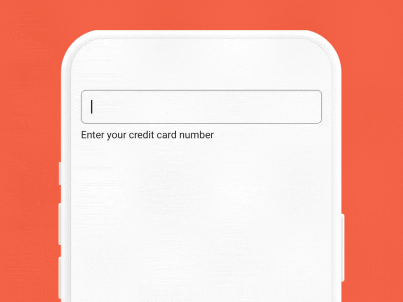
5) Masked Text Field for Credit Card Input
@Composable
fun CreditCardTextField() {
var text by remember { mutableStateOf("") }
val visualTransformation = CreditCardVisualTransformation()

    Column(modifier = Modifier.padding(16.dp)) {
        BasicTextField(
            value = text,
            onValueChange = { text = it.filter { it.isDigit() } },
            visualTransformation = visualTransformation,
            textStyle = TextStyle(color = Color.Black, fontSize = 18.sp),
            modifier = Modifier
                .fillMaxWidth()
                .border(1.dp, Color.Gray, RoundedCornerShape(8.dp))
                .padding(16.dp)
        )

        Spacer(modifier = Modifier.height(8.dp))

        Text(text = "Enter your credit card number", style = TextStyle(fontSize = 16.sp))
    }
}

// Sample transformation for example purposes only
class CreditCardVisualTransformation : VisualTransformation {
override fun filter(text: AnnotatedString): TransformedText {
val trimmed = if (text.text.length >= 16) text.text.substring(0..15) else text.text
val out = StringBuilder()

for (i in trimmed.indices) {
out.append(trimmed[i])
if (i % 4 == 3 && i != 15) out.append(" ")
        }

val creditCardOffsetTranslator = object : OffsetMapping {
override fun originalToTransformed(offset: Int): Int {
if (offset <= 3) return offset
if (offset <= 7) return offset + 1
if (offset <= 11) return offset + 2
if (offset <= 16) return offset + 3
return 19
            }

override fun transformedToOriginal(offset: Int): Int {
if (offset <= 4) return offset
if (offset <= 9) return offset - 1
if (offset <= 14) return offset - 2
if (offset <= 19) return offset - 3
return 16
            }
        }

return TransformedText(AnnotatedString(out.toString()), creditCardOffsetTranslator)
    }
}
Explanation
- Visual Transformation for Masking — A custom
VisualTransformationclass,CreditCardVisualTransformation, is created to format the input text by adding spaces every four characters. TheOffsetMappingwithin this class ensures that cursor movement is correctly handled, aligning with the formatted text.
Where else can it be applied?
- Phone Number Input — Automatically formats the input to match the standard phone number format (e.g.,
(123) 456-7890). - Social Security Number (SSN) Input — Masks the input to follow the SSN format (e.g.,
123-45-6789). - Date Input — Formats the input to a date format (e.g.,
MM/DD/YYYY).
6) Handling User Interactions

@Composable
fun InteractiveTextField() {
var text by remember { mutableStateOf("") }
val interactionSource = remember { MutableInteractionSource() }
val focusRequester = remember { FocusRequester() }

    LaunchedEffect(interactionSource) {
        interactionSource.interactions.collect { interaction ->
when (interaction) {
is PressInteraction.Press -> println("Testing TextField Pressed")
is PressInteraction.Release -> println("Testing TextField Released")
is FocusInteraction.Focus -> println("Testing TextField Focused")
is FocusInteraction.Unfocus -> println("Testing TextField Unfocused")
            }
        }
    }

    Column(modifier = Modifier.padding(16.dp)) {
        BasicTextField(
            value = text,
            onValueChange = { text = it },
            interactionSource = interactionSource,
            modifier = Modifier
                .fillMaxWidth()
                .border(1.dp, Color.Gray, RoundedCornerShape(8.dp))
                .padding(16.dp)
                .focusRequester(focusRequester)
        )

        Spacer(modifier = Modifier.height(8.dp))

        Button(onClick = { focusRequester.requestFocus() }) {
            Text(text = "Focus TextField")
        }
    }
}
Explanation
- A
MutableInteractionSourceis used to track and respond to user interactions with the text field. - This allows the detection of presses, releases, focus, and unfocus events.
- A
LaunchedEffectis used to collect and handle interactions from theMutableInteractionSource. - This effect prints messages to the console when the text field is pressed, released, focused, or unfocused.
- A
FocusRequesteris used to programmatically request focus for the text field. - A button is provided to demonstrate this functionality.
Use Cases
- Form Validation — Real-time feedback for errors and validations. Example — Showing error messages when the user leaves a field.
- Accessibility Enhancements — Improves navigation for users relying on assistive technologies. Example — Highlighting focused fields for users with visual impairments.
- User Engagement — Makes the app feel more responsive and dynamic. Example — Displaying search suggestions as the user types.
- Contextual Actions — Trigger actions based on user interactions. For example saving drafts when the user unfocuses a text field.
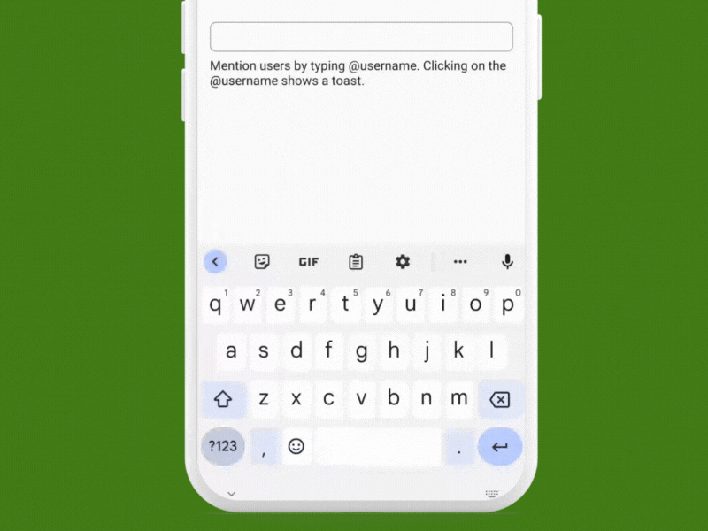
7) Real Time User Tagging
@Composable
fun RealTimeUserTaggingTextField() {
    var text by remember { mutableStateOf("") }
    val context = LocalContext.current

    val annotatedText = buildAnnotatedString {
        val regex = Regex("@[\\w]+")
        var lastIndex = 0
        regex.findAll(text).forEach { result ->
            append(text.substring(lastIndex, result.range.first))
            pushStringAnnotation(tag = "USER_TAG", annotation = result.value)
            withStyle(style = SpanStyle(color = Color.Blue, textDecoration = TextDecoration.Underline)) {
                append(result.value)
            }
            pop()
            lastIndex = result.range.last + 1
        }
        append(text.substring(lastIndex))
    }

    val focusRequester = remember { FocusRequester() }

    Column (modifier = Modifier.padding(horizontal = 16.dp)) {
        Spacer(modifier = Modifier.height(300.dp))

        BasicTextField(
            value = text,
            onValueChange = { text = it },
            textStyle = TextStyle(color = Color.Black, fontSize = 18.sp),
            modifier = Modifier
                .fillMaxWidth()
                .clickable {
                    focusRequester.requestFocus()
                }
                .focusRequester(focusRequester)
                .border(1.dp, Color.Gray, RoundedCornerShape(8.dp))
                .padding(8.dp),
            decorationBox = { innerTextField ->
                Box {
                    ClickableText(
                        text = annotatedText,
                        onClick = { offset ->
                            focusRequester.requestFocus()
                            annotatedText.getStringAnnotations(tag = "USER_TAG", start = offset, end = offset).firstOrNull()?.let {
                                val username = it.item
                                Toast.makeText(context, "User $username clicked", Toast.LENGTH_SHORT).show()
                            }
                        },
                        style = TextStyle(color = Color.Black, fontSize = 18.sp)
                    )
                    innerTextField()
                }
            }
        )

        Spacer(modifier = Modifier.height(8.dp))

        Text(text = "Mention users by typing @username. Clicking on the @username shows a toast.", style = TextStyle(fontSize = 16.sp))
    }
}
Explanation
- An annotated string is built to detect and highlight user tags in the text. The
Regexidentifies patterns matching@[\\w]+(e.g.,@username). Each detected tag is annotated and styled with a blue underline. - A
FocusRequesteris used to programmatically manage focus on the text field. Clicking anywhere in the text field or on a user tag requests focus for the text field. - The
ClickableTextcomposable handles click events on the annotated text. When a user tag is clicked, it requests focus for the text field and displays a toast message with the username.
Other Use Cases
- Hashtags in Social Media Posts
- Mentioning Users in Comments
- Dynamic Address Input Fields
Job Offers
Jobs
8) Keyboard Actions

@Composable
fun KeyboardActionsTextField() {
    var text by remember { mutableStateOf("Lorem Ipsum Lorem Ipsum") }
    val context = LocalContext.current

    Column {
        Spacer(modifier = Modifier.height(300.dp))

        BasicTextField(
            value = text,
            onValueChange = { text = it },
            textStyle = TextStyle(color = Color.Black, fontSize = 18.sp),
            modifier = Modifier
                .fillMaxWidth()
                .border(1.dp, Color.Gray, RoundedCornerShape(8.dp))
                .padding(8.dp),
            keyboardOptions = KeyboardOptions.Default.copy(
                imeAction = ImeAction.Send
            ),
            keyboardActions = KeyboardActions(
                onDone = {
                    Toast.makeText(context, "Done action pressed: $text", Toast.LENGTH_SHORT).show()
                },
                onSearch = {
                    Toast.makeText(context, "Search action pressed: $text", Toast.LENGTH_SHORT).show()
                },
                onGo = {
                    Toast.makeText(context, "Go action pressed: $text", Toast.LENGTH_SHORT).show()
                },
                onSend = {
                    Toast.makeText(context, "Send action pressed: $text", Toast.LENGTH_SHORT).show()
                }
            )
        )
    }
}
Explanation
keyboardOptionsspecifies the options for the keyboard, such as the IME action.keyboardActionsspecifies the actions to be taken when specific keys are pressed.
Use Cases
- Forms
- Search Bar
- Communication Apps
- Navigation Between Screens
9) Providing Haptic Feedback
@Composable
fun AccessibleForm() {
var email by remember { mutableStateOf("") }
var submissionStatus by remember { mutableStateOf("") }
var charVibration by remember { mutableStateOf("") }
val context = LocalContext.current
val vibrator = ContextCompat.getSystemService(context, Vibrator::class.java)
val brailleMap = mapOf(
'a' to longArrayOf(0, 50), // Example Braille pattern for 'a'
'b' to longArrayOf(0, 50, 100, 50),
'c' to longArrayOf(0, 100),
'.' to longArrayOf(0, 100, 100, 100),
'@' to longArrayOf(0, 200),
'o' to longArrayOf(0, 200, 200, 200),
'm' to longArrayOf(0, 200, 200, 200, 200, 200),
// Add mappings for other characters
)
val vibrate = { pattern: LongArray ->
if (vibrator?.hasVibrator() == true) {
vibrator.vibrate(VibrationEffect.createWaveform(pattern, -1))
}
}
val validateEmail = { input: String ->
when {
input.isEmpty() -> {
vibrate(longArrayOf(0, 100, 100, 100)) // Warning vibration
"Email cannot be empty"
}
!android.util.Patterns.EMAIL_ADDRESS.matcher(input).matches() -> {
vibrate(longArrayOf(0, 100, 100, 100, 100, 100, 100, 100)) // Error vibration
"Invalid email address"
}
else -> {
vibrate(longArrayOf(0, 50)) // Success vibration
null
}
}
}
Column(modifier = Modifier.padding(horizontal = 16.dp, vertical = 100.dp)) {
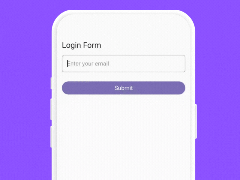
Text("Login Form", style = TextStyle(fontSize = 24.sp, color = Color.Black))
Spacer(modifier = Modifier.height(16.dp))
BasicTextField(
value = email,
onValueChange = { newText ->
email = newText
newText.lastOrNull()?.let { char ->
brailleMap[char]?.let { pattern ->
charVibration = "Vibrating for $char ➡ ${pattern.asList()}"
vibrate(pattern)
}
}
},
textStyle = TextStyle(color = Color.Black, fontSize = 18.sp),
modifier = Modifier
.fillMaxWidth()
.border(1.dp, Color.Gray, RoundedCornerShape(8.dp))
.padding(8.dp),
decorationBox = { innerTextField ->
Box(
modifier = Modifier.padding(8.dp)
) {
if (email.isEmpty()) {
Text("Enter your email", style = TextStyle(color = Color.Gray, fontSize = 18.sp))
}
innerTextField()
}
}
)
Spacer(modifier = Modifier.height(8.dp))
if(charVibration.isNotEmpty()) {
Text(charVibration, style = TextStyle(fontSize = 16.sp, color = Color.DarkGray))
}
Spacer(modifier = Modifier.height(16.dp))
Button(
onClick = {
val emailError = validateEmail(email)
submissionStatus = if (emailError == null) {
"Submission successful"
} else {
"Submission failed: $emailError"
}
if (emailError == null) {
vibrate(longArrayOf(0, 50, 50, 50, 50, 50, 50, 50)) // Success vibration
}
},
modifier = Modifier.fillMaxWidth()
) {
Text("Submit", style = TextStyle(fontSize = 18.sp, color = Color.White))
}
Spacer(modifier = Modifier.height(16.dp))
if(submissionStatus.isNotEmpty()) {
val textColor = if (submissionStatus.contains("failed")) Color.Red else Color.Green
Text("Submission status ➡ $submissionStatus", style = TextStyle(fontSize = 16.sp, color = textColor))
}
}
}
Explanation
- Braille Mapping — Characters are mapped to specific vibration patterns.
- Real-time Feedback — Immediate haptic feedback for each character input.
- Validation Feedback — Distinct vibration patterns for errors, warnings, and successes.
Other Use Cases
- Password Strength Indicators
- Multi-step Form Completion Feedback
- Interactive Learning Tools for Braille
10) Supporting Rich Media Content
Rich media support in text fields allows users to insert images, GIFs, and other multimedia content directly from the keyboard / clipboard using their text input. This feature is particularly useful in chat applications, social media posts, and other contexts where users might want to include visual content alongside text.
@OptIn(ExperimentalFoundationApi::class)
@Composable
fun SupportRichContent() {
var images by remember { mutableStateOf<List<Uri>>(emptyList()) }
val state = rememberTextFieldState("")
val scrollState = rememberScrollState()
val coroutineScope = rememberCoroutineScope()
Column(
modifier = Modifier
.padding(16.dp)
.fillMaxWidth()
) {
Spacer(Modifier.height(125.dp))
Row(
modifier = Modifier
.padding(bottom = 8.dp)
.fillMaxWidth()
.horizontalScroll(scrollState),
horizontalArrangement = Arrangement.spacedBy(8.dp)
) {
images.forEach { uri ->
AsyncImage(
model = uri,
contentDescription = null,
modifier = Modifier
.size(100.dp)
.clip(RoundedCornerShape(8.dp))
.border(1.dp, Color.Gray, RoundedCornerShape(8.dp)),
contentScale = ContentScale.Crop
)
}
}
BasicTextField(
state = state,
modifier = Modifier
.fillMaxWidth()
.background(Color.LightGray, RoundedCornerShape(8.dp))
.padding(16.dp)
.contentReceiver(
receiveContentListener = object : ReceiveContentListener {
override fun onReceive(
transferableContent: TransferableContent
): TransferableContent? {
if (!transferableContent.hasMediaType(MediaType.Image)) {
return transferableContent
}
return transferableContent.consume { item ->
images += item.uri
coroutineScope.launch {
scrollState.animateScrollTo(scrollState.maxValue)
}
true
}
}
}
),
textStyle = TextStyle(color = Color.Black, fontSize = 18.sp),
)
}
}
Explaination
- Using
contentReceiver Modifier — Enables rich media insertion directly from the keyboard / clipboard. - Transferable Content — It provides metadata and methods to handle the content.
hasMediaType— Checks if the content matches a specific media type, such as images.
Current Limitations — This is the new code available in foundation library 1.7.0-beta05. Works seamlessly on Pixel devices; issues for Samsung and other devices can be tracked here. For broader compatibility, use version 1.7.0-alpha04 that supports the old version of contentReceiver.
Conclusion
As we wrap up this exploration of text field features in Jetpack Compose, it’s clear that text fields offer much more than basic input functionality. They are powerful tools for creating rich, interactive, and visually engaging user experiences.
Changing the Minutest Detail
We started with the basics and gradually introduced more functionalities such as gradient text and cursor, custom decoration boxes, and funky text styles. These enhancements not only make the interface more appealing but also significantly improve user interaction and engagement.
Delivering Visual and Functional Excellence
Implementing rich media support demonstrates how to blend aesthetic appeal with practical functionality. Enabling users to insert images, GIFs, and other media via text fields enriches the user experience. This capability is crucial for applications such as chat apps and social media platforms, where visual content plays a significant role in user interaction.
Ensuring Accessibility and Usability
Providing haptic feedback and implementing masked text fields are essential for creating inclusive applications. These features ensure that your app is accessible and usable by a broader audience, including users with disabilities.
Closing Remarks
It’s good to be back to writing after such a long time. I look forward to returning to my original schedule moving forward.
If you liked what you read, please feel free to leave your valuable feedback or appreciation. I am always looking to learn, collaborate and grow with fellow developers.
If you have any questions feel free to message me!
Follow me on Medium for more articles — Medium Profile
Connect with me on LinkedIn and Twitter for collaboration.
Happy Composing! (Pun Intended)
This article is previously published on proandroiddev.com


