


Hello developers, in the first part we have seen how different the Design System of Wear OS works other than Android. In this article, we will be starting our journey by looking into basic things and UI elements of Wear OS.
I hope you will learn something new in this article which will help you to create your Wear OS app with ease.
If you haven’t checked the first part please check out Design System for WearOS.
Setting up
Using Jetpack Compose with Wear OS is similar to using Jetpack Compose for any other Android project. The main difference is that Jetpack Compose for Wear adds Wear-specific libraries that make it easy for users to create interfaces for watches. Let’s see the difference between the imports, components share the same name as their non-wear counterparts, such as androidx.wear.compose.material.Button and androidx.compose.material.Button.
Create your Compose project for Wear OS

After creating your project navigate to build.gradle.kts file and check the dependencies.
| [versions] | |
| agp = "8.4.0" | |
| kotlin = "1.9.0" | |
| playServicesWearable = "18.1.0" | |
| composeBom = "2023.08.00" | |
| composeMaterial = "1.2.1" | |
| composeFoundation = "1.2.1" | |
| activityCompose = "1.7.2" | |
| coreSplashscreen = "1.0.1" | |
| [libraries] | |
| play-services-wearable = { group = "com.google.android.gms", name = "play-services-wearable", version.ref = "playServicesWearable" } | |
| compose-bom = { group = "androidx.compose", name = "compose-bom", version.ref = "composeBom" } | |
| ui = { group = "androidx.compose.ui", name = "ui" } | |
| ui-tooling-preview = { group = "androidx.compose.ui", name = "ui-tooling-preview" } | |
| ui-tooling = { group = "androidx.compose.ui", name = "ui-tooling" } | |
| ui-test-manifest = { group = "androidx.compose.ui", name = "ui-test-manifest" } | |
| ui-test-junit4 = { group = "androidx.compose.ui", name = "ui-test-junit4" } | |
| compose-material = { group = "androidx.wear.compose", name = "compose-material", version.ref = "composeMaterial" } | |
| compose-foundation = { group = "androidx.wear.compose", name = "compose-foundation", version.ref = "composeFoundation" } | |
| activity-compose = { group = "androidx.activity", name = "activity-compose", version.ref = "activityCompose" } | |
| core-splashscreen = { group = "androidx.core", name = "core-splashscreen", version.ref = "coreSplashscreen" } | |
| [plugins] | |
| android-application = { id = "com.android.application", version.ref = "agp" } | |
| jetbrains-kotlin-android = { id = "org.jetbrains.kotlin.android", version.ref = "kotlin" } |
After checking our dependencies we are ready to build our first UI for the Wear OS app. Let’s navigate to MainActivity.kt
| class MainActivity : ComponentActivity() { | |
| override fun onCreate(savedInstanceState: Bundle?) { | |
| installSplashScreen() | |
| super.onCreate(savedInstanceState) | |
| setContent { | |
| WearApp("Android") | |
| } | |
| } | |
| } | |
| @Composable | |
| fun WearApp(greetingName: String) { | |
| WearUITheme { | |
| Box( | |
| modifier = Modifier | |
| .fillMaxSize() | |
| .background(MaterialTheme.colors.background), | |
| contentAlignment = Alignment.Center | |
| ) { | |
| TimeText() | |
| Text( | |
| modifier = Modifier.fillMaxWidth(), | |
| textAlign = TextAlign.Center, | |
| color = MaterialTheme.colors.primary, | |
| text = stringResource(R.string.hello_world, greetingName) | |
| ) | |
| } | |
| } | |
| } |
Over here you will find the boilerplate code, let’s give it a run and check the result.

As you see, the code is similar to Jetpack Compose but some UI elements are slightly different for Wear OS. Now we will see some of the most preferred UI elements for Wear OS.
1. Buttons

Buttons are generally used in circular shapes in WearOS applications, the most important feature that distinguishes them from Chips is that they are circular.

2. Chips

The Chips component is an interactive compact element that represents an input, attribute, or action.
| @Composable | |
| fun ChipExample() { | |
| Chip( | |
| onClick = { /*TODO*/ }, | |
| label = { | |
| Text(text = "Tools") | |
| }, | |
| icon = { | |
| Icon( | |
| painter = painterResource(id = R.drawable.tools), | |
| contentDescription = null, | |
| modifier = Modifier | |
| .size(ChipDefaults.LargeIconSize) | |
| .wrapContentSize(align = Alignment.Center) | |
| ) | |
| } | |
| ) | |
| } |

You can also create Image chips which also contain actions that relate to a chosen image. Image chips work well to communicate a more specific look and feel.

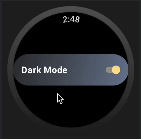
3. Toggle chips

A Toggle chip is a specialized chip that allows users to select various options.
| @Composable | |
| fun ToggleChipExample() { | |
| var checked by remember { mutableStateOf(true) } | |
| ToggleChip( | |
| modifier = Modifier.fillMaxWidth(), | |
| label = { | |
| Text("Dark Mode") | |
| }, | |
| checked = checked, | |
| colors = ToggleChipDefaults.toggleChipColors( | |
| uncheckedToggleControlColor = ToggleChipDefaults.SwitchUncheckedIconColor | |
| ), | |
| toggleControl = { | |
| Switch( | |
| checked = checked, | |
| enabled = true, | |
| modifier = Modifier.semantics { | |
| this.contentDescription = | |
| if (checked) "On" else "Off" | |
| } | |
| ) | |
| }, | |
| onCheckedChange = { checked = it }, | |
| enabled = true, | |
| ) | |
| } |
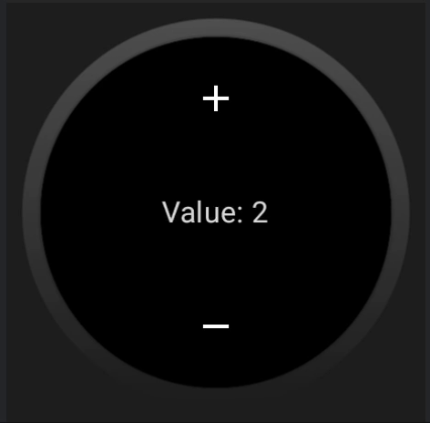
4. Steppers

The Stepper component allows users to make a selection from a range of values. Use steppers for a full-screen control experience that allows users to make a selection from a range of values.
| @Composable | |
| fun SteppersExample() { | |
| var value by remember { mutableIntStateOf(2) } | |
| Column( | |
| Modifier.fillMaxSize(), | |
| horizontalAlignment = Alignment.CenterHorizontally, | |
| verticalArrangement = Arrangement.Center | |
| ) { | |
| Stepper( | |
| value = value, | |
| onValueChange = { value = it }, | |
| increaseIcon = { Icon(StepperDefaults.Increase, "Increase") }, | |
| decreaseIcon = { Icon(StepperDefaults.Decrease, "Decrease") }, | |
| valueProgression = 0..10 | |
| ) { Text("Value: $value") } | |
| } | |
| } |
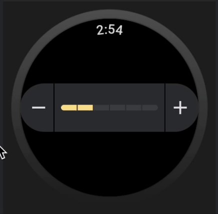
5. Sliders

The Slider component allows users to make selections from a range of values.
Job Offers
OUR VIDEO RECOMMENDATION


Jobs
| @Composable | |
| fun SliderExample() { | |
| var value by remember { mutableFloatStateOf(4f) } | |
| Column( | |
| Modifier.fillMaxSize(), | |
| horizontalAlignment = Alignment.CenterHorizontally, | |
| verticalArrangement = Arrangement.Center | |
| ) { | |
| InlineSlider( | |
| value = value, | |
| onValueChange = { value = it }, | |
| increaseIcon = { Icon(InlineSliderDefaults.Increase, "Increase") }, | |
| decreaseIcon = { Icon(InlineSliderDefaults.Decrease, "Decrease") }, | |
| valueRange = 3f..6f, | |
| steps = 5, | |
| segmented = true | |
| ) | |
| } | |
| } |
6. Cards

The Card component contains content and actions about a single subject. A card component only has a single slot. Cards can contain icons, images, or labels, and are customizable.
By default, cards are rectangular with rounded corners and a gradient background. Set the maximum height of your card to 60% to ensure that it’s fully displayed on the screen because circular displays can clip up to 20% of the top and bottom of the screen.
| Column( | |
| modifier = Modifier.padding(8.dp) | |
| ) { | |
| TitleCard( | |
| onClick = {}, | |
| title = { Text("Workout") }, | |
| contentColor = MaterialTheme.colors.onSurface, | |
| titleColor = MaterialTheme.colors.onSurface | |
| ) { | |
| Text("1 Hour 32 mins") | |
| } | |
| } |

7. Progress Indicator

The CircularProgressIndicator component is a circular display of the length of a process or an otherwise unspecified wait time. Use progress indicators to show the proportion of a task that is complete. To show progress an indicator is animated along a circular track in a clockwise direction.
| CircularProgressIndicator( | |
| progress = .7f, | |
| modifier = Modifier | |
| .fillMaxSize() | |
| .padding(all = 1.dp), | |
| startAngle = 295.5f, | |
| endAngle = 245.5f, | |
| indicatorColor = MaterialTheme.colors.secondary, | |
| trackColor = MaterialTheme.colors.onBackground.copy(alpha = 0.1f), | |
| strokeWidth = 6.dp | |
| ) |

8. List

Lists are continuous, vertical indexes of elements. Use ScalingLazyColumn to create lists on Wear OS. ScalingLazyColumn is built specifically for Wear OS and extends the LazyColumn class. Lists offer scaling and transparency, which allows content to shrink and fade at the top and bottom of the screen to help users see what to focus on. Lists are anchored on the center of the screen, which gives additional emphasis to the items in the middle of the list.
| val listState = rememberScalingLazyListState() | |
| val list: List<String> = | |
| listOf("Kotlin", "Jetpack Compose", "Android", "Kotlin Notebook", "KMP", "CMP", "Koin") | |
| Column(Modifier.fillMaxSize()) { | |
| ScalingLazyColumn( | |
| state = listState, | |
| scalingParams = ScalingLazyColumnDefaults.scalingParams( | |
| edgeScale = 0.5f, | |
| minTransitionArea = 0.6f, | |
| maxTransitionArea = 0.7f | |
| ) | |
| ) { | |
| itemsIndexed(items = list) { index, item -> | |
| Card( | |
| onClick = {}, | |
| modifier = Modifier.fillMaxWidth(), | |
| contentColor = Color.Black, | |
| ) { | |
| Column( | |
| Modifier.fillMaxSize(), | |
| horizontalAlignment = Alignment.CenterHorizontally, | |
| verticalArrangement = Arrangement.Center | |
| ) { | |
| Text(item, textAlign = TextAlign.Center) | |
| } | |
| } | |
| } | |
| } | |
| } |

We’ve seen some of the UI components used in WearOS. You can easily create your beautiful and custom UI design using these UI components in your projects.
References
https://developer.android.com/training/wearables/compose?source=post_page—–f6dd92f54e0d——————————–
Conclusion
I am confident that you will find this blog extremely helpful! In the next part, we will learn how we can create a simple UI in Wear OS. With the help of these UI components, you can quickly design the interfaces of our own WearOS. 😀 Please give feedback and leave a comment below ⬇️.
If you like this write-up, do share it 😉, because…
“Sharing is Caring”
Thank you! 😄
Let’s catch up on Twitter or LinkedIn to know more about me 😁
Bye 👋
This is previously published on proandroiddev.com


